Email creative design is often treated as surface work.
That is a mistake.
For hotels, creative design influences whether a message feels credible, premium, coherent, and worth acting on before the recipient reads a single line of copy. In a crowded inbox, design does not merely decorate the offer. It establishes brand quality, controls attention, shapes readability, and determines whether the email feels like a continuation of the guest experience or just another promotion competing for a click.
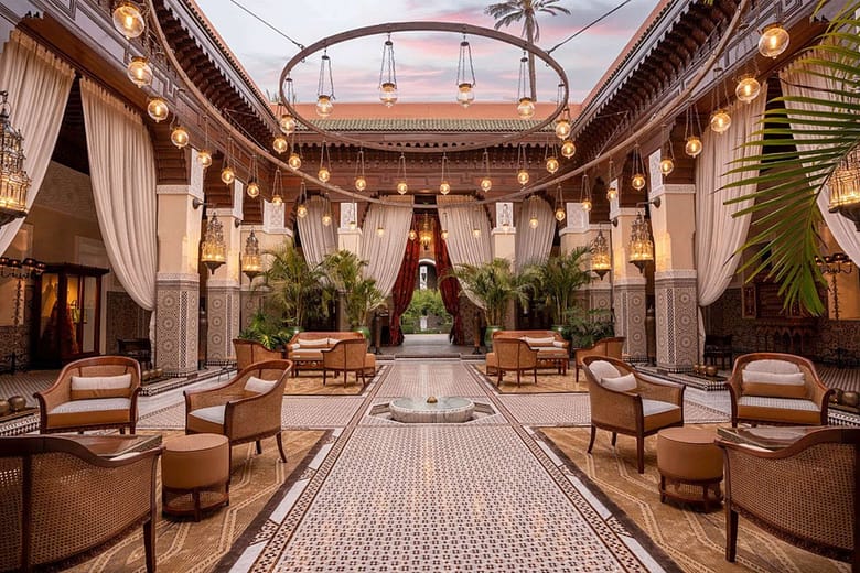
This is especially important in hospitality, where the product is emotional before it is transactional. Guests do not evaluate a hotel the way they evaluate a commodity. They evaluate it through cues: confidence, atmosphere, consistency, taste, restraint, and relevance. Email creative design is one of the places where those cues either hold together or fall apart.
When the design is weak, the problem is not only aesthetic. Weak creative can make the property feel less differentiated, reduce trust, bury the call to action, and lower response even when the offer itself is sound. When the design is strong, email becomes more than a distribution channel. It becomes a controlled brand environment inside the inbox.
That is why hotel email creative should be judged by more than whether it “looks good.” The real question is whether the design helps the hotel communicate value clearly enough to influence attention, shape perception, and move the guest toward action.
Email Design Is Part of the Revenue System, Not a Finishing Touch
Many hotels still treat design as the final step in the process. The strategy is set, the offer is chosen, the copy is drafted, and then design is asked to make the message attractive. That sequence undervalues what creative actually does.
Email design affects how the message is consumed. It controls hierarchy. It decides what gets seen first, what feels secondary, what creates momentum, and what interrupts it. It influences whether the reader understands the offer quickly, whether the property feels premium, and whether the email supports or weakens the booking path.
In practice, that means creative design has direct impact on performance. A poorly structured email can suppress response even with strong copy and a relevant offer. A well-structured email can improve clarity, reduce friction, and increase the likelihood that the guest reaches the click with the right understanding of what is being offered.
This is one reason email marketing for hotels should not be framed only as automation, segmentation, or send frequency. The design layer is part of the operating system. It is where positioning, readability, and conversion pressure meet.
What Strong Hotel Email Creative Actually Has to Do
Strong hotel email design has four jobs.
1. Establish immediate brand credibility
The first seconds matter. Before a guest evaluates the offer, they evaluate the presentation. If the design feels cluttered, generic, outdated, or visually inconsistent with the property, the email starts at a disadvantage. The recipient may not consciously articulate that reaction, but it affects trust and attention immediately.
2. Create a clear visual hierarchy
A hotel email should not make the reader work to understand what matters. The headline, supporting image, body copy, and call to action need a deliberate order. The eye should move through the message naturally. If every element competes for attention, the design is not helping. It is creating friction.
3. Translate the property experience into the inbox
A hotel does not sell only a room. It sells atmosphere, confidence, and anticipated experience. The email should reflect that reality. Typography, spacing, image selection, pacing, and layout all contribute to whether the email feels aligned with the property’s positioning or detached from it.
4. Support action without feeling desperate
Good hotel email creative does not need to shout. It needs to make action easy. The design should guide the guest toward the click with enough clarity and confidence that the CTA feels like the next logical step, not an abrupt demand.
Why Generic Email Design Underperforms in Hospitality
Generic email templates fail in hotel marketing for a simple reason: they flatten differences that matter.
A hotel’s value is shaped by perception. The same promotion can feel compelling or forgettable depending on how it is presented. If the design looks interchangeable with retail, e-commerce, or low-consideration travel promotions, the property loses some of its pricing power before the guest even reaches the website.
This is where many hotel emails break down. They are technically functional, but strategically weak. The layout is crowded. The images are uncurated. The typography feels generic. The buttons are oversized or disconnected from the visual rhythm. The result is not catastrophic, but it is costly. The email no longer reinforces the property’s positioning. It dilutes it.
For premium and luxury properties, that dilution matters even more. Design inconsistency makes the brand feel less controlled. If the website, on-property experience, and sales narrative all communicate quality, but the email looks disposable, the inbox becomes the weak link in the chain.
The Core Principles Behind Effective Hotel Email Creative
Clarity before decoration
Hotel emails should be visually strong, but clarity comes first. The design should make the message easier to understand, not more “designed” for its own sake. Decorative complexity is not sophistication. If the recipient cannot understand the message quickly, the creative has failed regardless of how polished it appears.
Restraint over clutter
Too many hotels try to include everything in one send: multiple offers, too many images, too many text blocks, too many calls to action. That usually weakens performance. Better creative uses restraint. One message, one hierarchy, one clear path.
Consistency over novelty
Novelty is not the objective. Recognition is. If every email looks unrelated to the last one, the brand never compounds in the inbox. Strong hotel creative uses a consistent design language so the recipient immediately recognizes the property’s visual system even before engaging with the content.
Mobile usability as a baseline requirement
Responsive design is not a bonus feature. It is a baseline requirement. Spacing, font size, image treatment, button placement, and content stacking must all work on mobile. If the design breaks down on a phone, the email is underperforming where much of the audience is actually opening it.
Design Decisions That Most Affect Performance
Some design choices matter more than others.
Image selection
Not every attractive image is the right email image. The creative should support the message, not compete with it. A hero image should clarify the emotional frame of the offer and align with the property’s positioning. Weak image selection creates confusion, or worse, makes the email feel like stock marketing.
Typography
Typography carries more strategic weight than many teams realize. Fonts affect readability, tone, and perceived quality. The wrong font pairing can make a premium property feel generic. The right typography creates structure, confidence, and distinction without calling attention to itself.
Spacing and white space
White space is not empty space. It is a control mechanism. It improves readability, creates rhythm, and allows the important elements to breathe. Crowded design makes an email feel cheaper and harder to process.
CTA treatment
The call to action should be unmistakable, but it should still belong to the design system. Too often, hotel emails use buttons that feel visually disconnected from everything around them. Strong creative makes the CTA prominent without making it look bolted on.
Why This Matters More for Luxury and High-Consideration Hotels
Luxury and high-consideration properties face a harder creative standard because the guest is not only evaluating utility. The guest is evaluating judgment.
In that environment, creative inconsistency is not a minor flaw. It becomes a signal. If the hotel cannot present itself with control and coherence in the inbox, the guest may reasonably wonder whether the promise is as strong as the imagery elsewhere suggests.
For these properties, email design has to do more than highlight promotions. It has to preserve tone. It has to feel considered. It has to signal that the property understands how to present itself without over-selling itself.
That is why creative consistency matters so much. When layout, image treatment, typography, and pacing align with the hotel’s broader identity, the email becomes part of the brand experience rather than a break from it.
Email Creative Should Be Evaluated Like an Operating Asset
Hotels often evaluate email creative informally. Someone likes the design or does not. The message feels on-brand or does not. That is too subjective.
Email creative should be evaluated as an operating asset with performance implications. That means asking harder questions:
- Does the email communicate the offer clearly within seconds?
- Does the layout create a controlled reading path?
- Does the design reinforce the property’s positioning?
- Does the mobile version preserve hierarchy and usability?
- Does the CTA feel like the natural next step?
- Does the creative help the hotel look more differentiated or less?
Those are better standards than simply asking whether the email is attractive.
Where Hotels Usually Get It Wrong
The most common mistakes are predictable.
- They overload the email with too many messages.
- They rely on templates that do not reflect the property’s positioning.
- They treat imagery as decoration instead of communication.
- They let mobile usability become an afterthought.
- They separate strategy, copy, and design as if they do not influence one another.
These mistakes are not unusual, but they are expensive. They reduce clarity, weaken brand reinforcement, and make the inbox one more place where the property underperforms without fully understanding why.
What Better Email Creative Makes Possible
Better creative does not magically fix poor strategy, weak offers, or inconsistent positioning. But when the fundamentals are sound, it increases the likelihood that those strengths are actually perceived by the recipient.
That is the real role of design in hotel email marketing. It helps the hotel communicate value with more control. It makes the message easier to process, the brand easier to trust, and the booking path easier to follow.
In other words, creative quality affects commercial quality.
For hotels trying to improve response, strengthen direct demand, and present a more controlled brand in the inbox, the creative layer should be treated as part of the revenue system, not as decoration added at the end. That is also why many properties eventually need a more specialized email design service or a more integrated hospitality email marketing agency approach when in-house execution is inconsistent.
Final Thought
Email creative design still matters because perception still matters.
Before a guest clicks, compares, or books, the email has already started shaping the decision. The question is whether the design is helping the hotel communicate quality, clarity, and confidence — or quietly weakening all three.