Why Luxury Email Design Is a Psychological Conversion System, Not a Visual Template
Luxury hotel email design is not simply an exercise in aesthetics — it is an exercise in psychology.
Affluent travelers make decisions based on emotional cues, perceived exclusivity, sensory appeal, and the subtle signals that define premium brands. In luxury hospitality, the design of your email is often the difference between a direct booking… and a guest drifting back to an OTA.
This guide breaks down the psychological principles AGR uses when crafting luxury hotel email creative — and why these design systems consistently outperform generic hotel email templates. If you want the broader strategy behind how email creates compounding direct-booking value, start with our complete guide to email marketing for hotels.
1. Luxury Guests Don’t Want to Be Sold — They Want to Be Transported
Affluent travelers are not primarily responding to promotion. They are responding to identity, immersion, and emotional resonance.
That requires design choices that communicate restraint and confidence:
- Less clutter
- More storytelling
- Elevated tone
- Premium photography
- Intentional whitespace
Guests are not buying a room. They are buying a mood, a moment, and a feeling of escape.
This is the foundation of effective luxury marketing: design that pulls the reader into the resort experience before they ever click through.
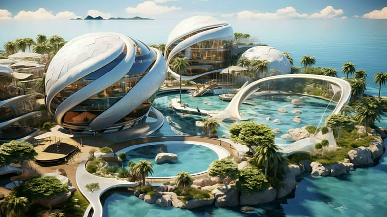
2. The “Visual Escape” Principle: High-End Imagery Creates High-End Booking Intent
Your hero image is the psychological anchor of the entire email.
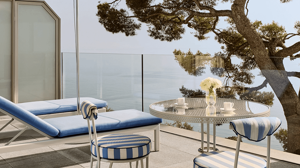
Luxury travelers form impressions extremely fast, and their brains respond emotionally before logically. High-impact visual triggers tend to include:
- Warm, cinematic tones
- Sunrise and golden-hour lighting
- Water movement (associated with calm and restoration)
- Minimal text overlay
- Horizon lines that create openness
This is why high-performing luxury creatives prioritize immersive, aspirational visuals rather than “promo banner” energy.
Great images aren’t decoration — they are conversion mechanisms.
3. The Cognitive Load Rule: Less Information Converts Better
Luxury buyers do not want to sift through clutter.
Their cognitive tolerance for marketing messages is lower because:
- They are busy
- They receive premium messaging from many brands
- They expect effortless communication
A luxury email should typically follow a simple ratio:
90% inspiration
10% information
Your content should feel:
- Scannable
- Breathable
- Concise
- Visually prioritized
This is where many hotel emails fail: they over-explain, over-stack modules, and overstuff offers. Luxury design wins by creating calm and clarity.
4. The Psychology of Color in Luxury Email Design
Color signals brand positioning instantly.
Luxury-optimized color psychology often maps like this:
- Dark blue / navy → trust, prestige
- Gold → exclusivity, sophistication
- Black → premium, modern, elegant
- White / cream → softness, luxury calm
- Emerald / sea tones → relaxation and escape
Bright colors (red, loud orange, neon tones) can unintentionally reduce luxury perception unless used sparingly as an accent for guidance (e.g., small CTA emphasis, not visual dominance).
Used well, color becomes a quiet reinforcement mechanism: “this brand is high-end” without stating it.
5. Copywriting Psychology: Fewer Words, Higher Revenue
Luxury travelers buy with emotional reasoning, not spreadsheet logic.
Effective luxury email copy tends to share these traits:
- Short sentences
- Sensory language
- Rhythm and pacing
- Subtlety, not hype
- An “invitation” tone instead of a “promotion” tone
In practice, shorter, elegant copy paired with high-impact visuals often drives more engagement than long, sales-driven paragraphs — because it matches the way premium guests prefer to be spoken to.
This same psychology is built directly into AGR’s luxury hotel email design services, where creative decisions are engineered to support brand perception, engagement, and direct-booking performance.
And when that creative discipline is executed within a cohesive program, it becomes a measurable lever inside a performance-driven hospitality email marketing agency system.
6. The Dominant Behavior Path: Design for How Eyes Actually Move
Most email designs are built like brochures. Luxury email designs should be built like behavior paths.
Readers typically:
- Look at the hero image first
- Jump to the button second
- Scan headlines third
- Read body copy last
So the email should be designed accordingly:
- Compelling hero image
- Prominent but elegant CTA
- Short headline blocks
- Digestible supporting content
This aligns the creative with human behavior — not arbitrary “design trends.”
7. The Psychology of Exclusivity: “This Offer Is for People Like Me”
Affluent guests respond strongly to exclusivity cues, especially when they feel personal rather than manufactured.
High-performing luxury framing often includes:
- Private access
- Invitation-only language
- Member-style benefits
- Elevated phrasing (“your next stay,” “your escape awaits”)
The best luxury emails feel personal, not promotional. They make the reader feel recognized.
This also connects directly to luxury positioning and brand perception — the same strategic territory covered in luxury hotel marketing.
8. The CTA Rule: Never Shout — Always Guide
High-end guests ignore pushy CTAs.
Luxury CTAs should be:
- Minimal
- Elegant
- Expectation-setting
- Benefit-driven
- Emotionally aligned
Examples that frequently outperform “BOOK NOW” in luxury segments:
- “Discover Your Escape”
- “View Availability”
- “Explore the Experience”
The CTA should feel like a natural next step — not a command.
9. Mobile-First Psychology: Most Opens Happen on Mobile
Luxury travelers scroll slowly but decisively.
On mobile, the email must feel:
- Fluid
- Readable
- Balanced
- Uncluttered
- Touch-friendly
Mobile-first luxury design typically favors:
- Edge-to-edge imagery
- Vertical storytelling
- Strong visual hierarchy
- Thumb-friendly buttons with adequate spacing
If the email feels cramped on mobile, it feels cheap — and cheap is the fastest way to lose a luxury buyer.
10. Why This Design System Wins for Luxury Resorts
Psychology is the silent engine behind high-performing luxury email design.
When creative is engineered correctly, it integrates:
- Behavioral psychology
- Emotional triggers
- Visual hierarchy
- Cognitive load reduction
- Segmentation alignment
- Mobile-first behavior
- Exclusivity framing
- Iterative performance testing
This is the difference between “nice-looking emails” and an email system that consistently drives direct bookings and protects brand equity.
If you want a broader perspective on where design fits inside the full marketing mix (and where hotels often waste budget), this is also where a specialized partner differs from a general hotel marketing agency that treats email as a secondary channel.
Frequently Asked Questions About Luxury Hotel Email Design
What makes luxury hotel email design different from standard hotel email design?
Luxury hotel email design prioritizes emotional resonance, visual restraint, and brand perception over volume, urgency, or promotion. Unlike standard hotel emails—which often emphasize discounts and dense information—luxury emails are designed to create a sense of escape, exclusivity, and calm that aligns with how affluent travelers make buying decisions.
Why does email design matter so much for luxury hotel bookings?
For luxury brands, design is inseparable from trust. Affluent travelers subconsciously evaluate brand quality within seconds, and poorly designed emails can erode perceived value before a guest ever reaches the booking engine. Effective luxury email design reinforces brand equity while guiding guests toward direct booking behavior.
How many images should a luxury hotel email include?
In most cases, fewer images perform better. One strong hero image, supported by minimal secondary visuals if necessary, typically outperforms image-heavy layouts. The goal is immersion and focus, not visual noise. Luxury email design favors clarity and emotional impact over quantity.
Do “Book Now” buttons work for luxury hotel emails?
Hard-sell CTAs like “Book Now” often underperform in luxury segments. High-end guests respond better to guiding language such as “View Availability,” “Discover Your Escape,” or “Explore the Experience.” These CTAs feel aligned with the guest journey rather than transactional pressure.
How does email design fit into a broader luxury hotel marketing strategy?
Email design is one component of a larger system that includes segmentation, cadence, messaging, and lifecycle alignment. When design is paired with a disciplined email marketing for hotels strategy, it becomes a compounding asset that supports direct bookings, guest loyalty, and reduced OTA dependence.